2019. 4. 17. 13:19ㆍR/Basic

Data Visualiation의 필수 도구
기본 함수보다는 복잡하지만, 엑셀에도 구현하기 힘든 퀄리티와 복잡한 그래프를 순식간에 생성해 낸다
Create Elegant Data Visualisations Using the Grammar of Graphics
A system for 'declaratively' creating graphics, based on "The Grammar of Graphics". You provide the data, tell 'ggplot2' how to map variables to aesthetics, what graphical primitives to use, and it takes care of the details.
ggplot2.tidyverse.org
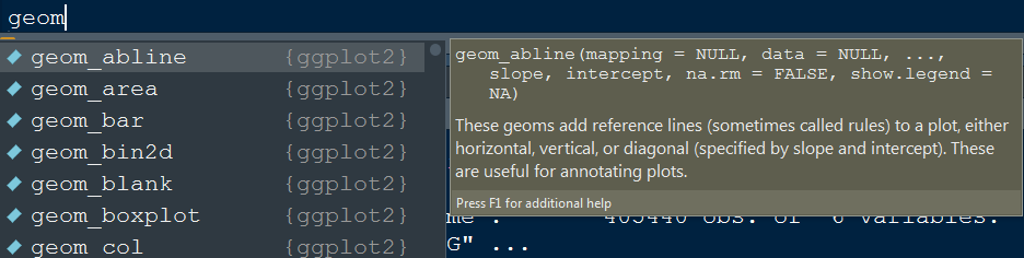
설치
이 쪽을 선택하면 설치와 로딩이 간편너무나도 유명한 패키지라서 tidyverse에 포함되어 있다.
# The easiest way to get ggplot2 is to install the whole tidyverse:
install.packages("tidyverse")

# Alternatively, install just ggplot2:
install.packages("ggplot2")

# Or the the development version from GitHub:
# install.packages("devtools")
devtools::install_github("tidyverse/ggplot2")
ggplot2의 레이어 구조

Data
데이터를 단순히 입력해서는 아무일도 일어나지 않는다
ggplot(data=mtcars)AESTHETICS
aes(x, y, .... )
데이터를 표시할 축을 설졍해주는 단계. 역시 그래프가 생성되지 않는다
ggplot(data=mtcars, aes(x=mpg, y=wt)) GEOMETRICS
데이터를 좌표계에 뿌려줄 방법을 설정해주는 함수
ggplot(data=mtcars, aes(x=mpg, y=wt)) + geom_point()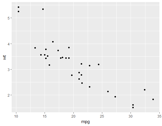
ggplot(data=mtcars, aes(x=mpg, y=wt)) + geom_dotplot( binwidth = 2)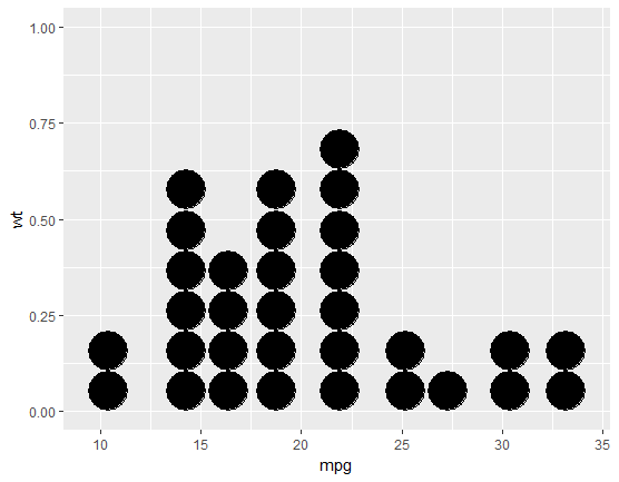

FACETS
Facet을 사용하면 동시에 여러개의 그래프를 출력할 수 있다.
특정 변수를 그룹화하여 소규모의 다양한 그래프를 출력한다
ggplot(data=mtcars, aes(x=mpg, y=wt))
+ geom_point()
+ facet_grid(gear ~ .)   #Facets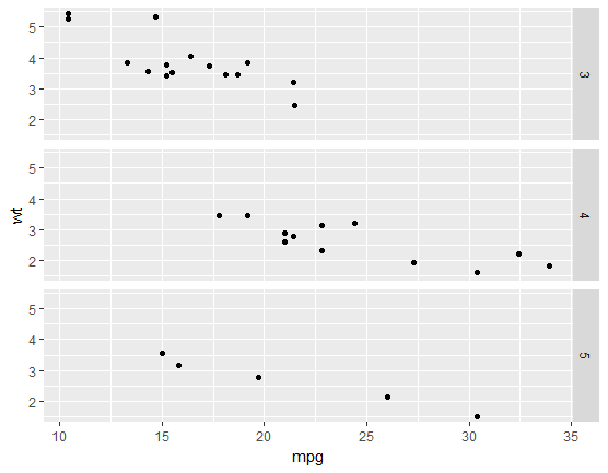
-
facet_grid : 데이터를 그리드 패널로 변경
-
facet_wrap : 1차원 배치를 2 차원으로 변경
ggplot(data=mtcars, aes(x=mpg, y=wt)) + geom_point()
+ facet_wrap(~gear, ncol=2)
ggplot(data=mtcars, aes(x=mpg, y=wt))
+ geom_point()
+ facet_grid(gear ~cyl )
STATISTICS
aesthetic에 데이터를 매핑하기 전에 데이터를 요약할 필요가 있다.
geom에 관련된 기본 기능이 있지만, 더 명확한 결과물을 얻기 위해서는 다른 방법을 써야 한다
ggplot(data=mtcars, aes(x=mpg, y=wt))
+ geom_point()
+ facet_grid(gear ~ .)
+ stat_smooth()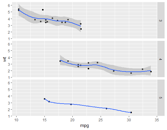
COORDINATES
좌표 시스템은 좌표계를 변경할 수 있다.
-
데카르트 좌표 (cartesian coordinate)
-
극 좌표
-
원 좌표
ggplot(data=mtcars, aes(x=mpg, y=wt)) + geom_point()
+ facet_grid(gear ~ .) + stat_smooth()
+ coord_cartesian(xlim = c(13, 30))

ggplot(data=mtcars, aes(x=mpg, y=wt)) + geom_point()
+ facet_grid(gear ~ .) + stat_smooth()
+ coord_cartesian(xlim = c(1, 40))

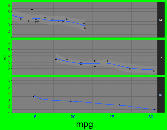
THEME
ggplot(data=mtcars, aes(x=mpg, y=wt)) + geom_point()
+ facet_grid(gear ~ .) + stat_smooth()
+ coord_cartesian(xlim = c(13, 30)) + theme_dark()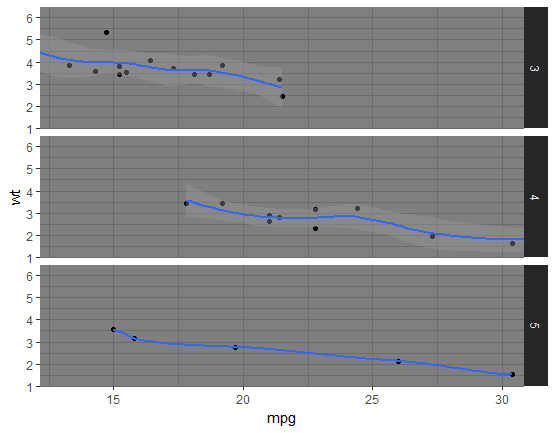
ggplot(data=mtcars, aes(x=mpg, y=wt)) + geom_point()
+ facet_grid(gear ~ .) + stat_smooth()
+ coord_cartesian(xlim = c(13, 30)) + theme_dark()
+ theme(axis.text.x = element_text(colour="blue", size=rel(1.2)),
axis.title.x = element_text(size=rel(2)),
plot.background = element_rect(fill = 'green', colour = 'red'))